
The Navigation Blocks widget lets you create one or more link buttons. Below are examples of the versatility of our navigation blocks.
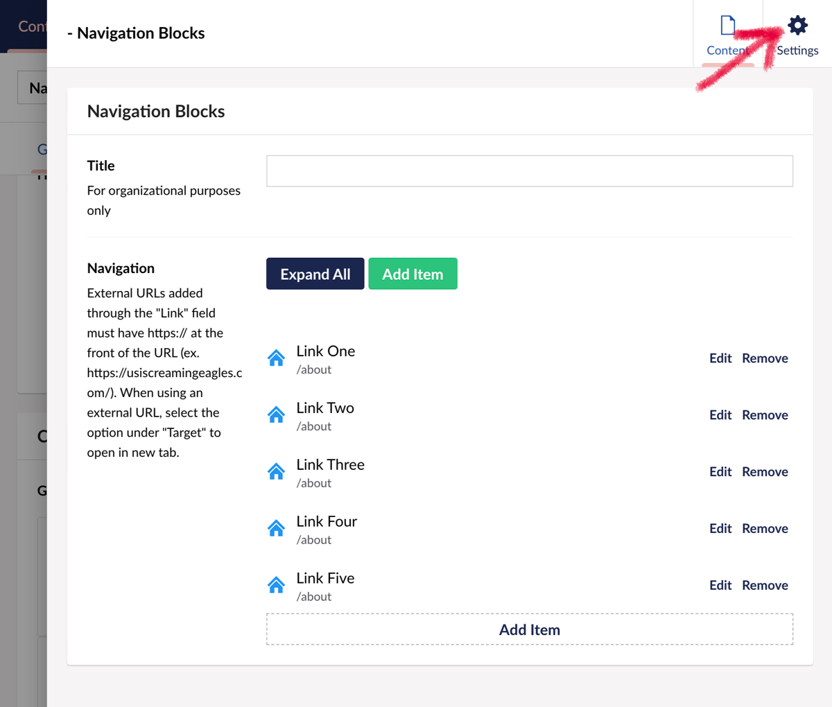 After creating your navigation links, click on the Settings tab to access the styling options for Navigation Blocks.
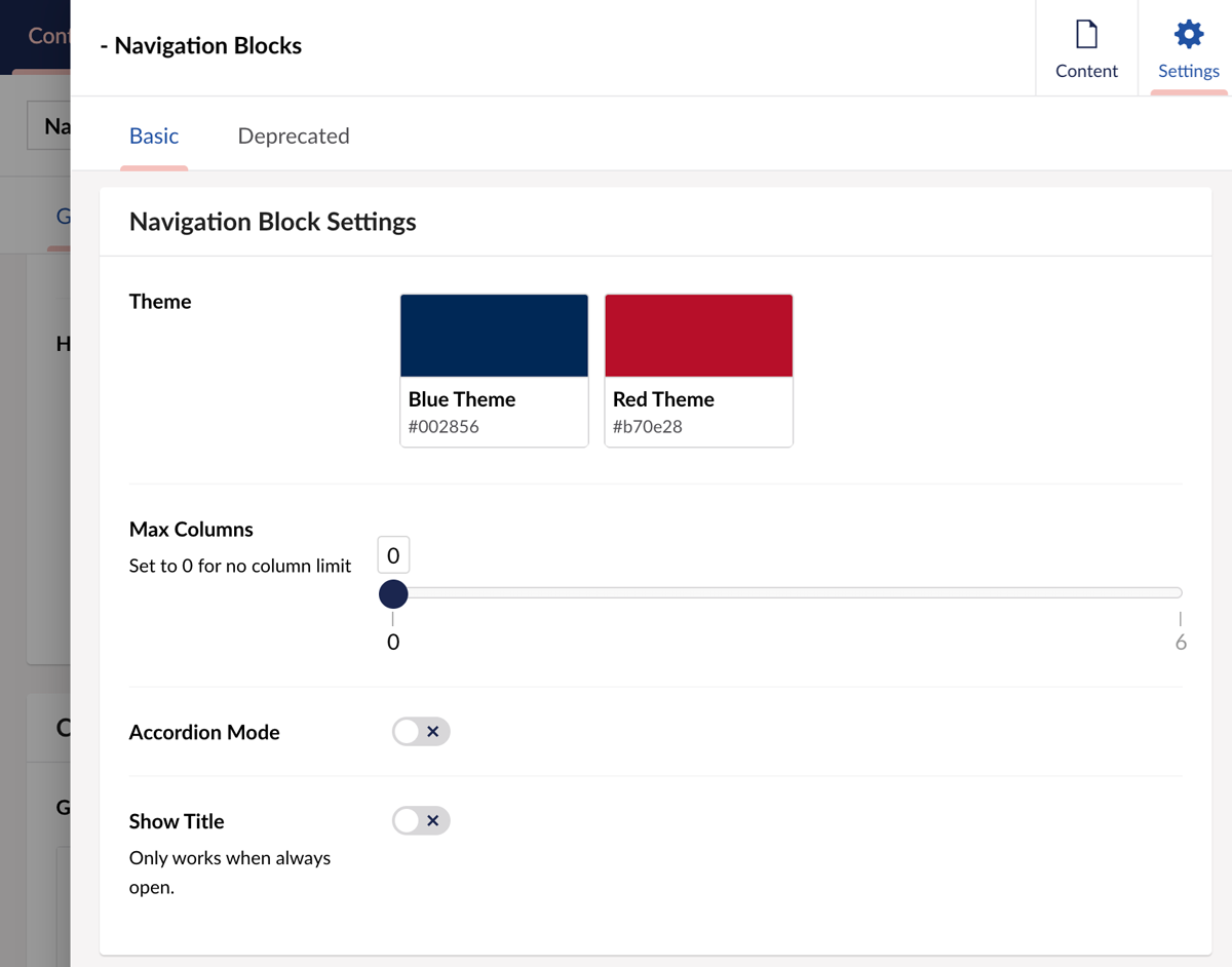 You have two themes to choose from Blue or Red. Click one to select.
Max Columns: This lets you set how many blocks to appear. For example, if you want a vertical column of links, you would choose 1.
Accordion Mode: Turn off/on. This collapses the blocks into an accordion.
Show Title: This adds the title you set for the widget at the top of your block grouping.
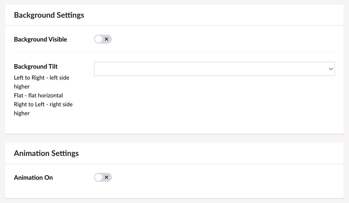 Background Settings are next.
Background Visible: Yes/No turns the background on or off.
Background Tilt: Lets you choose a style that adds a slight angle to the edge of your background. Choose Left to Right; Right to Left; or Flat.
Animation On: Yes/No activates subtle movement with the Navigation Blocks as they load onto the page.
Red theme, title on, animation on.
Blue theme, title off, accordion on, animation on.
Red theme, Title off, accordion off, background on, right to left, animation on.